Case study
See the curve before you change the plan.
The math for how a drug builds up in your body and then clears out has been published for decades. It's usually locked in journal papers, though, not in a tool you can actually use. We built one. It runs a pharmacokinetic model behind an interactive chart, so you can see the projected concentration curve before you change a dosing plan. Change the plan, and the curve updates.
- Product
- Tirzepatide PK Scheduler — a personal project
- Scope
- PK math engine, comparison UI, dose logging, self-hosted
- Stack
- React · TypeScript · Recharts · Express
- Fine print
- Educational tool — not medical advice, not a medical product
Your gut is a bad dose calculator.
People make dosing decisions without ever seeing the concentration curve those decisions create. Tirzepatide, like many long-half-life drugs, is a good example. After an injection, concentration rises for about a day and a half, then falls for several days. Doses stack on top of each other for weeks before reaching steady state. The shape of that curve is hard to predict by intuition.
Questions like what happens if the interval goes from seven days to ten have exact answers. You can calculate them. In practice, people don't. So we built a tool that does it. It runs a one-compartment pharmacokinetic model with first-order absorption, with parameters checked against published literature, live under the chart. Add or move any dose and the full concentration curve recalculates immediately using superposition.

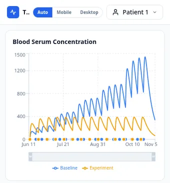
Baseline, experiment, actual
A baseline plan sits next to an experiment plan, and the FDA's standard titration schedule is available as a one-click template for the baseline. Set the experiment plan to a different dose, a different interval, or a skipped week, and the chart overlays both curves. The metrics panel compares them on peak, trough, average, peak-to-trough ratio, and total milligrams. Each one shows a percentage difference, so the result of your what-if is a number, not an estimate.
There's also a third plan type: actual. It records what really happened — logged doses, weights, injection sites, and notes on how the day felt — which makes the tool a record, not just a calculator. You can plan against the model, then compare the model with real results.
We built this for ourselves and host it on our own servers. It's an educational tool, not medical advice, and it's labeled that way. The engineering point is turning published math into something a person can use.
Start your project